Jump to content

Disney+ UX teardown: Wins, fails and fixes


NelsonG

Recommended Posts

Disney announced earlier this month that it’s going all-in on streaming media.

As part of this new strategy, the company is undergoing a major reorganisation of its media and entertainment business that will focus on developing productions that will debut on its streaming and broadcast services.

This will include merging the company’s media businesses, ads and distribution, and Disney+ divisions so that they’ll now operate under the same business unit.

As TechCrunch’s Jonathan Shieber reports, Disney’s announcement follows a significant change to its release schedule to address new realities, including a collapsing theatrical release business; production issues; and the runaway success of its Disney+ streaming service — all caused or accelerated by the national failure to effectively address the COVID-19 pandemic.

So what better time than now to give Disney+ the Extra Crunch user experience teardown treatment. With the help of Built for Mars founder and UX expert Peter Ramsey, we highlight some of the things Disney+ gets right and things that should be fixed. They include zero distractions while signing up, “the power of percentages,” and the importance of designing for trackpad, mouse and touch outside of native applications.

Zero distractions while signing up

If the user is trying to complete a very specific task — such as making a payment — don’t distract them. They’re experiencing event-driven behaviour.

The win: Disney have almost entirely removed any kind of distractions when signing up. This includes the header and footer. They want you to stay on-task.

Screen-Shot-2020-10-19-at-15.12.06.png?w

Image Credits: Disney+

Steve O’Hear: This seems like a very easy win but one we don’t see as often as perhaps we should. Am I right that most sign-up flows aren’t this distraction-free and why do you think that is?

Peter Ramsey: Yeah, it’s such an easy win. Sometimes you see sign-up screens that have Google Adwords on it, and I think, “You’re risking the user getting distracted and leaving for what, half a penny?” If I had to guess why more companies don’t utilise this technique, it’s probably just because they don’t want to deal with the technical hassle of hiding a bunch of elements.

The power of percentages

Only use percentages when it makes sense. 80% off sounds like a lot, but 3% doesn’t. Percentages can be a great way of making a discount seem larger than it actually is, but sometimes it can have the reverse effect. This is because people are generally bad at accurately estimating discounts. “What’s 13% off £78?”

The fail: If you sign up to a year of Disney+, then you’re offered 16% free. But 16% isn’t easy to calculate in your head — so people guess. And sometimes, their guesses may be less than the actual value of the discount.

The fix: In this instance, it would be far more compelling (and require less mental arithmetic), if it was marketed as “60 days free.” Sixty days is both easy to understand and easy to assign value to.

Percentages.jpg?w=680

Image Credits: Disney+

Percentages may be harder to process or evaluate in isolation as an end user but they are easy to compare with each other i.e., we all know 25% off is better than 10% off. Aren’t you advocating obscuring the actual saving in favour of what sounds better on a case-by-case basis and therefore actually working against the end user? Of course I’m playing devils advocate a little here.

So, it’s actually a really complex dilemma, and there’s no “easy” answer — this would probably make a great dinner time conversation. Yes, if you’re offering two discounts, then a percentage may be the easiest way for people to compare them.

Techcrunch?d=2mJPEYqXBVI Techcrunch?d=7Q72WNTAKBA Techcrunch?d=yIl2AUoC8zA Techcrunch?i=fd0IhX54SUs:KbJv41-eaaM:-BT Techcrunch?i=fd0IhX54SUs:KbJv41-eaaM:D7D Techcrunch?d=qj6IDK7rITs
fd0IhX54SUs

View the full article

Link to comment
Share on other sites

Please sign in to comment

You will be able to leave a comment after signing in


Sign In Now
  • Recently Browsing   0 members

    • No registered users viewing this page.
  • Our picks

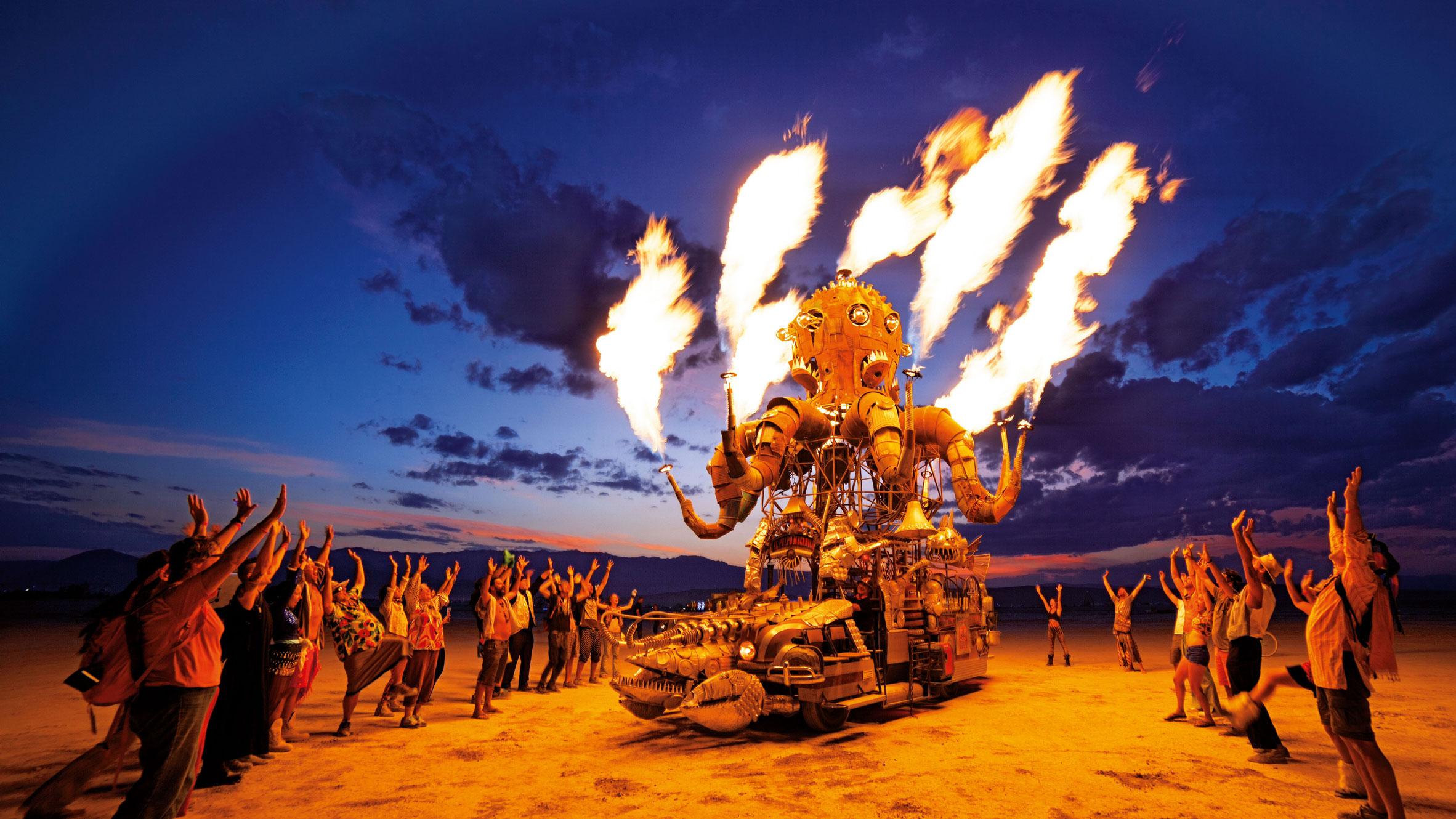
    • Wait, Burning Man is going online-only? What does that even look like?
      You could have been forgiven for missing the announcement that actual physical Burning Man has been canceled for this year, if not next. Firstly, the nonprofit Burning Man organization, known affectionately to insiders as the Borg, posted it after 5 p.m. PT Friday. That, even in the COVID-19 era, is the traditional time to push out news when you don't want much media attention. 
      But secondly, you may have missed its cancellation because the Borg is being careful not to use the C-word. The announcement was neutrally titled "The Burning Man Multiverse in 2020." Even as it offers refunds to early ticket buyers, considers layoffs and other belt-tightening measures, and can't even commit to a physical event in 2021, the Borg is making lemonade by focusing on an online-only version of Black Rock City this coming August.    Read more...
      More about Burning Man, Tech, Web Culture, and Live EventsView the full article
      • 0 replies
    • Post in What Are You Listening To?
      Post in What Are You Listening To?
    • Post in What Are You Listening To?
      Post in What Are You Listening To?
    • Post in What Are You Listening To?
      Post in What Are You Listening To?
    • Post in What Are You Listening To?
      Post in What Are You Listening To?
×
×
  • Create New...